Lesson 12: Another Look at the Nile Data
Here we’ll learn several new concepts, using the Nile data as our
starting point.
If you look again at the histogram of the Nile we generated, you’ll see a gap between the lowest numbers and the rest. In what year(s) did those really low values occur? Let’s plot the data against time:
> plot(Nile)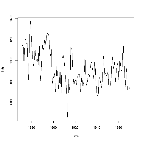
Looks like maybe 1912 or so was much lower than the rest. Is this an error? Or was there some big historical event then? This would require more than R to track down, but at least R can tell us which exact year or years correspond to the unusually low flow. Here is how:
We see from the graph that the unusually low value was below 600. We
can use R’s which function to see when that occurred:
> which(Nile < 600)
[1] 43
As before, make sure to understand what happened in this code. The
expression Nile < 600 yields 100 TRUEs and FALSEs. The which
then tells us which of those were TRUEs.
So, element 43 is the culprit here, corresponding to year 1871+42=1913. Again, we would have to find supplementary information in order to decide whether this is a genuine value or an error, but at least now we know the exact year.
Of course, since this is a small dataset, we could have just printed out the entire data and visually scanned it for a low number. But what if the length of the data vector had been 100,000 instead of 100? Then the visual approach wouldn’t work.
Tip: Remember, a goal of programming is to automate tasks, rather than doing them by hand.
Your Turn: There appear to be some unusually high values as well, e.g. one around 1875. Determine which year this was, using the techniques presented here.
Also, try some similar analysis on the built-in
AirPassengersdata. Can you guess why those peaks are occurring?
Here is another point: That function plot is not quite so innocuous
as it may seem. Let’s run the same function, plot, but with two
arguments instead of one:
> plot(mtcars$wt,mtcars$mpg)
In contrast to the previous plot, in which our data were on the vertical axis and time was on the horizontal, now we are plotting two vectors, against each other. This enables us to explore the relation between car weight and gas mileage.
There are a couple of important points here. First, as we might guess,
we see that the heavier cars tended to get poorer gas mileage. But
here’s more: That plot function is pretty smart!
Why? Well, plot knew to take different actions for different input
types. When we fed it a single vector, it plotted those numbers against
time (or, against index). When we fed it two vectors, it knew to do a scatter plot.
In fact, plot was even smarter than that. It noticed that Nile
is not just of 'numeric' type, but also of another class, 'ts'
(“time series”):
> is.numeric(Nile)
[1] TRUE
> class(Nile)
[1] "ts"
So, plot put years on the horizontal axis, instead of indices 1,2,3,…
And one more thing: Say we wanted to know the flow in the year 1925. The data start at 1871, so 1925 is 1925 - 1871 = 54 years later. Since the 1871 number is in element 1 of the vector, that means the flow for the year 1925 is in element 1+54 = 55.
> Nile[55]
[1] 698
OK, but why did we do this arithmetic ourselves? We should have R do it:
> Nile[1 + 1925 - 1871]
[1] 698
R did the computation 1925 - 1871 + 1 itself, yielding 55, then looked
up the value of Nile[55]. This is the start of your path to
programming — we try to automate things as much as possible, doing
things by hand as little as possible.