Lesson 15: More on Base Graphics
We can also plot multiple histograms on the same graph. But the
pictures are more effective using a smoothed version of histograms,
available in R’s density function. Let’s compare men’s and women’s
wages in the census data.
First we use split to separate the data by gender:
> wageByGender <- split(pe$wageinc,pe$sex)
> dm <- density(wageByGender[[1]])
> dw <- density(wageByGender[[2]])
So, wageByGender[[1]] will now be the vector of men’s wages,
and similarly wageByGender[[2]] will have the women’s wages.
The density function does not automatically draw a plot; it has the
plot information in a return value, which we’ve assigned to dm and
dw here. We can now plot the graph:
> plot(dw,col='red')
> points(dm,cex=0.2)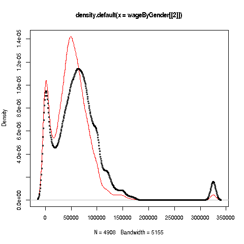
Why did we call the points function instead of plot in that
second line? The issue is that calling plot again would destroy the
first plot; we merely want to add points to the existing graph.
And why did we plot the women’s data first? As you can see, the women’s
curve is taller, so if we plotted the men first, part of the women’s
curve would be cut off. Of course, we didn’t know that ahead of time,
but graphics often is a matter of trial-and-error to get to the picture
we really want. (In the case of ggplot2, this is handled
automatically by the software.)
Well, then, what does the graph tell us? The peak for women, occurring at a little less than $50,000, seems to be at a lower wage than that for men, at something like $60,000. At salaries around, say, $125,000, there seem to be more men than women. (Black curve higher than red curve. Remember, the curves are just smoothed histograms, so, if a curve is really high at, say 168.0, that means that 168.0 is a very frequently-occurring value.)
Your Turn: Try plotting multiple such curves on the same graph, for other data.