Lesson 27: The ggplot2 Graphics Package
Now, on to ggplot2.
The ggplot2 package was written by Hadley Wickham, who later became
Chief Scientist at RStudio. It’s highly complex, with well over 400
functions, and rather abstract, but quite powerful. We will touch on it
at various points in this tutorial, while staying with base-R graphics
when it is easier to go that route.
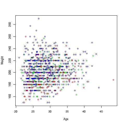
Now to build up to using ggplot2, let’s do a bit more with base-R
graphics first, continuing with our weight/age investigation of the
ballplayers. To begin, let’s do a scatter plot of weight against age,
color-coded by position. We could type
> plot(mlb$Age,mlb$Weight,col=mlb$PosCategory)but to save some typing, let’s use R’s with function (we’ll change
the point size while we are at it):
> with(mlb,plot(Age,Weight,col=PosCategory,cex=0.6))By writing with, we tell R to take Age, Weight and PosCategory in
the context of mlb.
Here is how we can do it in ggplot2:
First, I make an empty plot, based on the data frame mlb:
> p <- ggplot(mlb)Nothing will appear on the screen. The package displays only when you “print” the plot:
> pThis will just display an empty plot. (Try it.) By the way, recall that any expression you type, even 1 + 1, will be evaluated and printed to the screen. Here the plot (albeit) empty is printed to the screen.
Now let’s do something useful:
> p + geom_point(aes(x = Age, y = Weight, col = PosCategory),cex=0.6)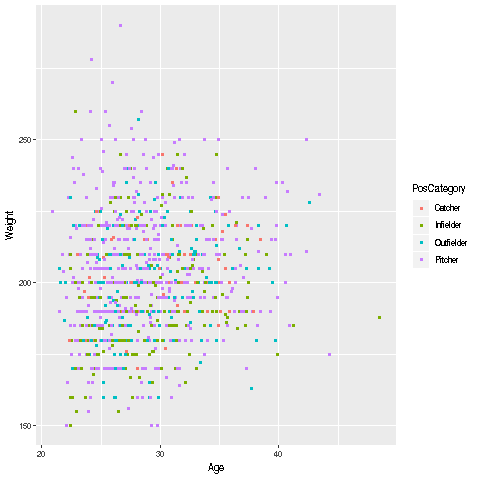
What happened here? Quite a bit, actually, so let’s take this slowly.
-
We took our existing (blank) plot,
p, and by writing the’+’ sign, directedggplot2to add to the plotp. -
Now, WHAT do we want added? We are saying,
ggplot2, please add to the plotpwhatevergeom_point()returns.” -
Note that
geom_point()is aggplot2function. Its task is to produce scatter plots. -
Here are the details on the arguments to
geom_point:-
We want to plot weight against height. We do not need to specify what data frame these two variables are from, as we already stated that the plot
pis for the data framemlb. -
We are also specifying that the color coding will be according to the player position, again from
mlb.
-
-
When R evaluates that entire expression,
p + geom_point(aes(x = Age, y = Weight, col = PosCategory),cex=0.6), the result will be anotherggplot2graph object. Since we typed that expression at the>prompt, it was then printed to the screen as seen above. -
There is one mystery left, though: What does the function
aes(‘aesthetic”) do? And why is the expressioncex=0.6NOT an argument toaes? Unfortunately, there are no easy answers to these questions, and in a rare exception to our rule of explaining all, we will just have to leave this as something that must be done.
One nice thing is that we automatically got a legend printed to the
right of the graph, so we know which color corresponds to which
position. We can do this in base-R graphics too, but need to set an
argument for it in plot.