Lesson 21: Do Professional Athletes Keep Fit?
Many people gain weight as they age. But what about professional athletes? They are supposed to keep fit, after all. Let’s explore this using data on professional baseball players. (Dataset courtesy of the UCLA Statistics Dept.)
> mlb <- read.table('https://raw.githubusercontent.com/matloff/fasteR/master/data/mlb.txt',header=TRUE)
> head(mlb)
             Name Team       Position Height Weight   Age PosCategory
1   Adam_Donachie  BAL        Catcher     74    180 22.99     Catcher
2       Paul_Bako  BAL        Catcher     74    215 34.69     Catcher
3 Ramon_Hernandez  BAL        Catcher     72    210 30.78     Catcher
4    Kevin_Millar  BAL  First_Baseman     72    210 35.43   Infielder
5     Chris_Gomez  BAL  First_Baseman     73    188 35.71   Infielder
6   Brian_Roberts  BAL Second_Baseman     69    176 29.39   Infielder
> class(mlb$Height)
[1] "integer"
> class(mlb$Name)
[1] "factor"
Tip: As usual, after reading in the data, we took a look around, glancing at the first few records, and looking at a couple of data types.
Now, as a first try in assessing the question of weight gain over time,
let’s look at the mean weight for each age group. In order to have
groups, we’ll round the ages to the nearest integer first, using the R
function, round, so that e.g. 21.8 becomes 22 and 35.1 becomes 35.
Let’s explore the data using R’s table function.
> age <- round(mlb$Age)
> table(age)
age
 21  22  23  24  25  26  27  28  29  30  31  32  33  34  35  36  37  38  39  40
  2  20  58  80 103 104 106  84  80  74  70  44  44  32  32  22  20  12   6   7
 41  42  43  44  49
  9   2   2   1   1
Not surprisingly, there are few players of extreme age — e.g. only two of age 21 and one of age 49. So we don’t have a good sampling at those age levels, and may wish to exclude them (which we will do shortly).
Now, how do we find group means? It’s a perfect job for the tapply
function, in the same way we used it before:
> taout <- tapply(mlb$Weight,age,mean)
> taout
      21       22       23       24       25       26       27       28
215.0000 192.8500 196.2241 194.4500 200.2427 200.4327 199.2925 203.9643
      29       30       31       32       33       34       35       36
199.4875 204.1757 202.8429 206.7500 203.5909 204.8750 209.6250 205.6364
      37       38       39       40       41       42       43       44
203.2000 200.6667 208.3333 207.8571 205.2222 230.5000 229.5000 175.0000
      49
188.0000
To review: The call to tapply instructed R to split the
mlb$Weight vector according to the corresponding elements in the
age vector, and then find the mean in each resulting group. This
gives us exactly what we want, the mean weight in each age group.
So, do we see a time trend above? Again, we should dismiss the extreme low and high ages, and we cannot expect a fully consistent upward trend over time, because each mean value is subject to sampling variation. (We view the data as a sample from the population of all professional baseball players, past, present and future.) That said, it does seem there is a slight upward trend; older players tend to be heavier!
By the way, note that taout is vector, but with additional
information, in that the elements have names, in this case the ages. In
fact, we can extract the names into its own vector if needed:
> names(taout)
 [1] "21" "22" "23" "24" "25" "26" "27" "28" "29" "30" "31" "32" "33"
"34" "35"
[16] "36" "37" "38" "39" "40" "41" "42" "43" "44" "49"
Let’s plot the means against age. We’ll just plot the means that are
based on larger amounts of data. So we’ll restrict it to, say, ages 23
through 35, all of whose means were based on at least 30 players. That
age range corresponded to elements 3 through 15 of taout, so here is
the code for plotting:
> plot(23:35,taout[3:15])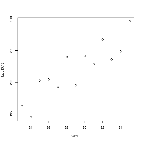
There does indeed seem to be an upward trend in time. Ballplayers should be more careful!
(Though it is far beyond the scope of this tutorial, which is on R rather than statistics, it should be pointed out that interpretation of the regression coefficients must be done with care. It may be, for instance, that heavier players tend to have longer careers. If so, fitting our linear form to data that has many older, heavier players may misleadingly imply that most individual players gain weight as they age. And of course, they would insist the gained weight is all muscle. :-) )
Note again that the plot function noticed that we supplied it with
two arguments instead of one, and thus drew a two-dimensional scatter
plot. For instance, in taout we see that for age group 25, the mean
weight was 200.2427, so there is a dot in the graph for the point
(25,200.2427).
Your Turn: There are lots of little experiments you can do on this dataset. For instance, use
tapplyto find the mean weight for each position; is the stereotype of thebeefycatcher accurate, i.e. is the mean weight for that position higher than for the others? Another suggestion: Plot the number of players at each age group, to visualize the ages at which the bulk of the players fall.