Lesson 14: Introduction to Base R Graphics
One of the greatest things about R is its graphics capabilities. There
are excellent graphics features in base R, and then many contributed
packages, with the best known being ggplot2 and lattice. These
latter two are quite powerful, and will be the subjects of future
lessons, but for now we’ll concentrate on the base.
As our example here, we’ll use a dataset I compiled on Silicon Valley programmers and engineers, from the US 2000 census. Let’s read in the data and take a look at the first records:
> pe <-
   read.table('https://raw.githubusercontent.com/matloff/fasteR/master/data/prgeng.txt',header=TRUE)
> head(pe)
       age educ occ sex wageinc wkswrkd
1 50.30082   13 102   2   75000      52
2 41.10139    9 101   1   12300      20
3 24.67374    9 102   2   15400      52
4 50.19951   11 100   1       0      52
5 51.18112   11 100   2     160       1
6 57.70413   11 100   1       0       0
We used read.table here because the file is not of the CSV type. It
uses blank spaces rather than commas as its delineator between fields.
Here educ and occ are codes, for levels of education and
different occupations. For now, let’s not worry about the specific
codes. (You can find them in the
Census Bureau document.
For instance, search for “Educational Attainment” for the educ
variable.)
Let’s start with a scatter plot of wage vs. age:
> plot(pe$age,pe$wageinc)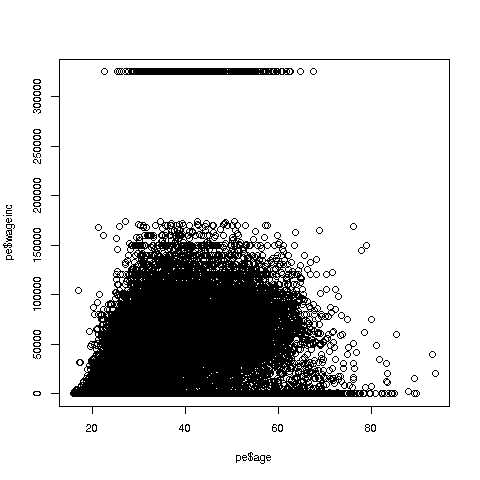
Oh no, the dreaded Black Screen Problem! There are about 20,000 data points, thus filling certain parts of the screen. So, let’s just plot a random sample, say 2500. (There are other ways of handling the problem, say with smaller dots or alpha blending.)
> indxs <- sample(1:nrow(pe),2500)
> pe2500 <- pe[indxs,]
Recall that the nrow() function returns the number of rows in the
argument, which in this case is 20090, the number of rows in pe.
R’s sample function does what its name implies. Here it randomly
samples 2500 of the numbers from 1 to 20090. We then extracted those
rows of pe, in a new data frame pe2500.
Tip: Note again that it’s clearer to break complex operations into simpler, smaller ones. I could have written the more compact
> pe2500 <- pe[sample(1:nrow(pe),2500),]but it would be hard to read that way. I also use direct function composition sparingly, preferring to break
h(g(f(x),3)into
y <- f(x)
z <- g(y,3)
h(z)
So, here is the new plot:
> plot(pe2500$age,pe2500$wageinc)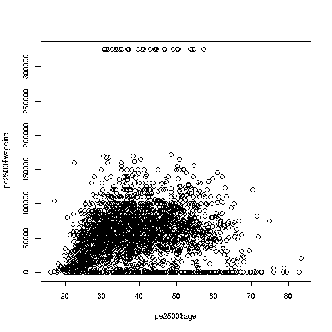
OK, now we are in business. A few things worth noting:
-
The relation between wage and age is not linear, indeed not even monotonic. After the early 40s, one’s wage tends to decrease. As with any observational dataset, the underlying factors are complex, but it does seem there is an age discrimination problem in Silicon Valley. (And it is well documented in various studies and litigation.)
-
Note the horizontal streaks at the very top and very bottom of the picture. Some people in the census had 0 income (or close to it), as they were not working. And the census imposed a top wage limit of $350,000 (probably out of privacy concerns).
We can break things down by gender, via color coding:
> plot(pe2500$age,pe2500$wageinc,col=as.factor(pe2500$sex))The col argument indicates we wish to color code, in this case by
gender. Note that pe2500$sex is a numeric vector, but col
requires an R factor; the function as.factor does the conversion.
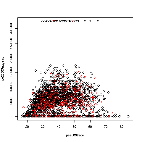
The red dots are the women. (Details below.) Are they generally paid less than men? There seems to be a hint of that, but detailed statistical analysis is needed (a future lesson).
It would be good to have better labels on the axes, and maybe smaller dots:
> plot(pe2500$age,pe2500$wageinc,col=as.factor(pe2500$sex),xlab='age',ylab='wage',cex=0.6)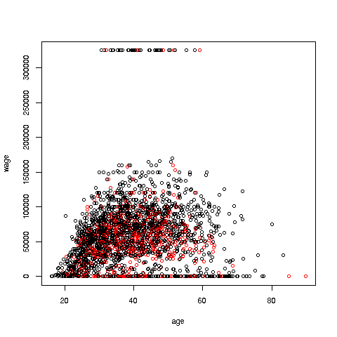
Here xlab meant “X label” and similarly for ylab. The argument cex = 0.6 means “Draw the dots at 60% of default size.”
Now, how did the men’s dots come out black and the women’s red? The men were coded 1, the women 2. So men got color 1 in the default palette, black, and the women color 2, red.
There are many, many other features. More in a future lesson.
Your Turn: Try some scatter plots on various datasets. I suggest first using the above data with wage against age again, but this time color-coding by education level. (By the way, 1-9 codes no college; 10-12 means some college; 13 is a bachelor’s degree, 14 a master’s, 15 a professional degree and 16 is a doctorate.)